


MARKS AND SPENCER
Marks & Spencer is one of the UK's oldest and most well-known brands. Marks & Spencer has continued to maintain its luxury image, justify its value through exceptional marketing, and adjust to the needs of a new audience, without faltering. A consistent focus on value, quality, and customer experience.
My Understandings: Marks & Spencer's evolution of logo shows how the brand evolves with consumers changing needs through time. They always use a wordmark logo with simple black and modern font, they give their customer a better quality of life. The company has been able to make the most out of its heritage as a classic British company without losing sight of the modern needs and expectations of its audience in this fast rapid era.

Logo History
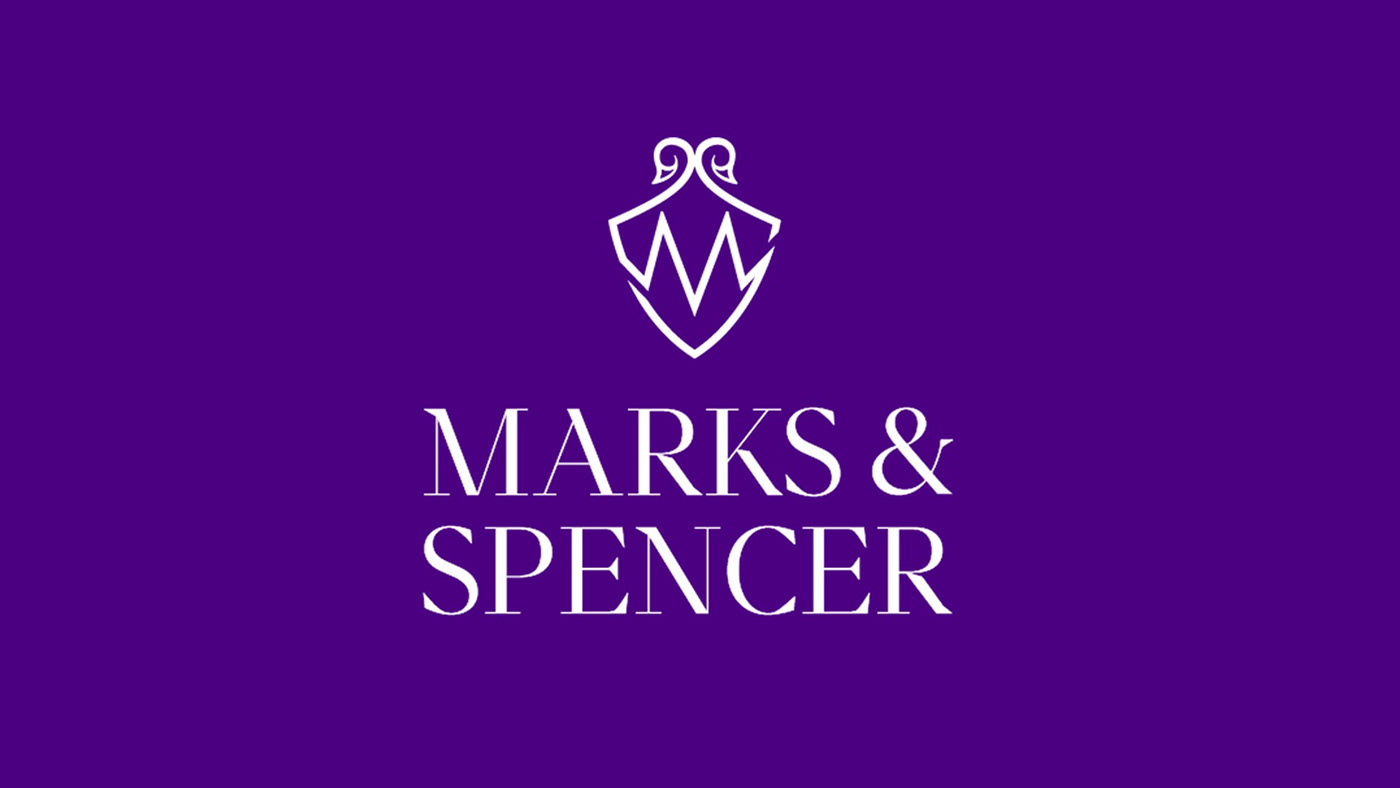
Finalized Logo
The Rebranded Logo: In the new logo, I had tried to incorporate brand values which they always maintain at the time of rebranding. So, in the logo I had taken ‘M’ & ‘S’ which is the initial of the company. I had also incorporated the head of the swan at the top of the logo which represents loyalty, luxury, beauty, trust, and grace. It somehow gives a feel of heritage as of classic British company.
Indigo color represents integrity and sincerity. The reason behind this color is integrity which strengthens brand reputation and sincerity which builds confidence and trust.

Logo Scribbles (Explored different variations)


THANKS FOR WATCHING!


